Historic Venue Reinvented for Mixed Use
When the iconic Uline Arena, also known as the Washington Coliseum, came into developers’ hands in 2015, the property was in great disrepair.
Decades before Antunovich Associates Architects partnered with Douglas Development to redevelop the 2.5-acre site, the venue where the Beatles held their first US concert had sunk into obscurity. On the adjacent brick icehouse, all that could be saved were the exterior walls. Not much was left inside and most of the roof was gone. The design team’s intent was to honor both the site’s cultural heritage and its original assets.“It was an exciting opportunity for me as a designer,” said Kevin Crosby, Associate Principal at Antunovich. “Having seen this decaying industrial building with its iconic shape for many years, never realizing its full potential, then given the opportunity to investigate and explore the buildings to revitalize them to what they are today.”
From Inaugural Ball to Trash Transfer
Originally built as an ice rink, the historic venue in the northeast section of the capital hosted a 1953 inaugural ball for President Eisenhower. In its prime, the arena with its famous barrel-vaulted concrete roof was home to professional hockey and basketball teams. It also staged performances from circus and ballet to car racing.
Then by 1973, the construction of the larger Capital Center east of the city had eclipsed the Uline. The site became little more than the target of vandalism. In 2003 it reached its lowest point: the trash disposal company that had purchased it as a transfer station applied for a permit to demolish it.
Preservationists intervened promptly. Within the year, it made the DC Preservation League’s list of “Most Endangered Places.” It went on to gain spots on the DC Historic Preservation Review Board’s official protection list and the National Register of Historic Places. In the meantime, Douglas Development acquired the property from the trash disposal company. By the time renovation work was set to begin, it was being used as a parking garage.
Reinvention for Mixed Use
Today, the Uline site houses some 150,000 square feet of office space. Where the arena had been open to the roof, three upper stories were created with rooftop terraces to bring in daylight. A 51,000-square-foot flagship REI store, the largest on the east coast, opened in 2016 on the ground floor. The renovation of the site as a mixed-use facility engaged the historic preservation review board and the community.
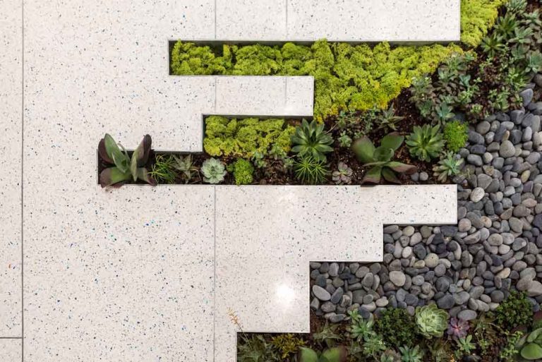
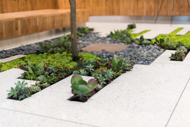
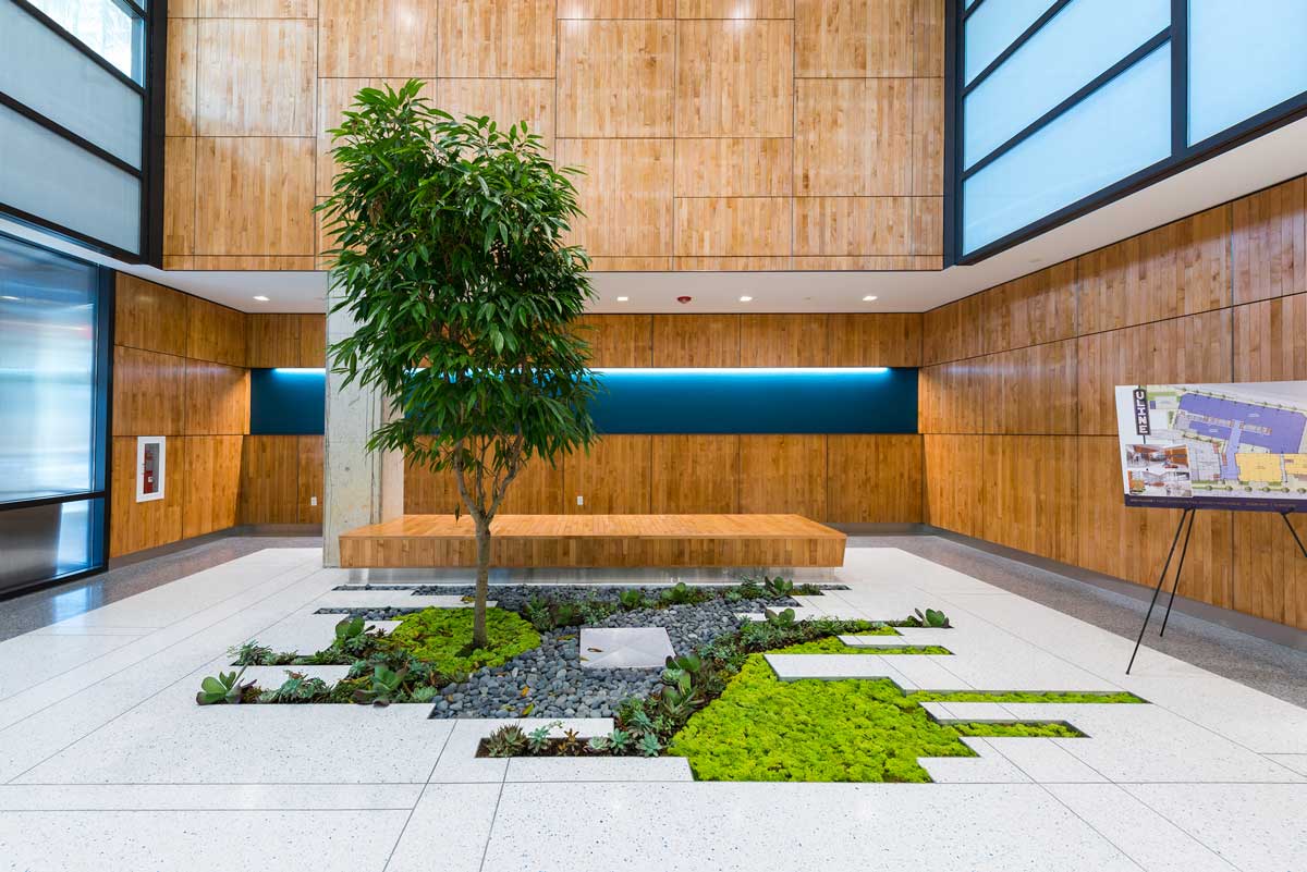
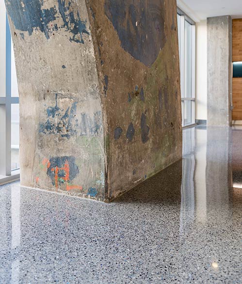
The design concept for the rehabilitation project for the ice house and arena is a modern aesthetic: contemporary finishes accented by industrial elements. A vibrant, lush oasis inlaid in the lobby floor is a dynamic focal point. The original concrete ribs remain, bearing the marks of graffiti. From the roof of the arena a series of steel pulleys that had held theatre lights were repurposed as custom lighting for the new lobby. The old basketball wood floor found new life as wall and ceiling panels.
The Challenge: Unifying the Spaces
The design team agreed on a grand lobby to connect the arena with the icehouse. The next imperative was to choose the right flooring and color palette to harmonize the various finishes and create a single identity within the project.
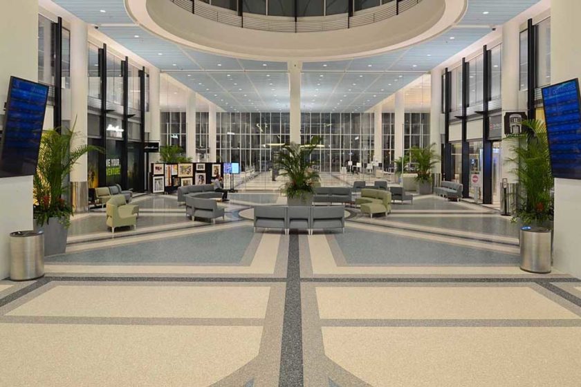
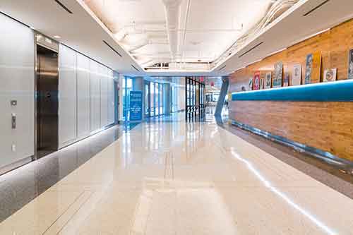
“We didn’t want to overpower the modern industrial look with a super dynamic floor,” Mr. Crosby explained. The solution was a total of 5,800 square feet of epoxy terrazzo in the lobby and corridors in the office spaces and extended through the ice house to the arena area. The terrazzo floor is a neutral canvas for the various design elements. A lighter field with zinc divider strips is set in an ashlar pattern, accented by a darker border and a subtly different pop of blue glass that anchors the palette.
“Terrazzo provided a connecting finish throughout all the spaces, a handsome, consistent look that did it for us,” Mr. Crosby said.
Burden of Choice
What’s appealing about working with terrazzo, Mr. Crosby said, is that it offers “such a diverse palette of components and aggregates that allows you to fully customize an installation.” That’s also what’s toughest about working with it, he added. His advice to architects: get an idea of what look you want before you start to look at chips and colors; allow time to get samples in hand.
Mr. Crosby credits Bethany Fischer, an architectural sales representative for Terrazzo & Marble Supply, with navigating the aggregate design. She identified a blend that gave them the sparkle they were looking for within budget.
To keep costs down, Ms. Fischer suggested using a majority of marble chips, with a smaller percentage of a more expensive recycled art glass in Wedgewood Blue. Lending visual interest and depth, it was just enough to echo the tones of both the developer’s logo and remnants of graffiti on the old columns.
“The same material can be used to evoke a range of aesthetics,” Ms. Fischer noted. “We can go from a more mid-century modern style with larger aggregates and more contrast, to the contemporary look at Uline with fine aggregates: minimal, sleek, monochromatic.”
Free-Form Focus
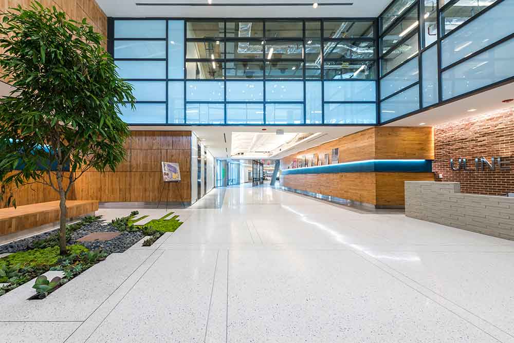
The plan for an inlaid planter in the lobby, flush with the floor and filled with succulents, moss, river rock, and a grand ficus tree, was “an opportunity to do something playful and compelling,” Mr. Crosby said. “We asked, ‘What does terrazzo allow?’”
They capitalized on the unique flexibility of a poured material that is manufactured by hand on site, to create terrazzo shapes that extend into the planting pit in varying lengths and widths. “The great thing is being able to set an intriguing form and fill it in to be seamless,” Mr. Crosby explained.
Behind-the-scenes
It was a challenge to figure out how to create the planter while ensuring a solid and durable product installation, explained Robert Goldstein, president of Atlantic Refinishing and Restoration, Inc., of Waldorf, MD, the terrazzo contractor. “The architect knew what he wanted it to look like; the execution was up to us,” he said.
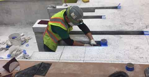
Careful substrate preparation was essential throughout the renovation for a sound installation, but particularly at the planter. Its perimeter was created using a four-inch sand/epoxy substrate on top of the mason’s rough dimensional installation of concrete masonry units.
“It’s not every day you work with a big rough hole in the floor with some blocks around it with crudely finished dimensions,” Mr. Goldstein noted. Creating the substrate involved meticulous work in making it dimensionally correct, square and plumb.
The extensions were built up with 3/8-inch epoxy. The exposed perimeter was then finished with a custom three-inch zinc edging with an integrated L-angle. The crew set the 50 to 60-pound strips into shape and secured them, for sharp, square edges. Due to the size and configuration of the extensions, all surfaces had to be hand-ground and polished to match the rest of the floor.
Making Conservation History
“Without completely reinventing the structure, the renovation let the building speak for itself,” Mr. Crosby reported. “We respected the bones of it—the original footprint is still there.”
The Uline restoration has been a significant player in a wave of development in the NoMa (“north of Massachusetts Avenue”) neighborhood, near Union Station. The project is the recipient of the 2017 Presidential Citation – Urban Catalyst Award for the Washington DC Chapter AIA.
Since the project’s completion, the Antunovich Associates Architects has moved its offices into the retail space next to the main lobby at Uline, where they walk past the terrazzo floor and the planter daily. “We are proud,” Mr. Crosby reported, “to have brought the historic Uline Arena back to life.”
Photos by Brycen Fischer

