It Becomes An Award-Winning Terrazzo Installation
When San Francisco’s premier event designer, Stanlee Gatti, acquired a building to renovate, he bought first and decided what purpose it would serve later.
“I bought the building because I loved the way it looked and wanted to make something wonderful out of it,” Mr. Gatti explained.
He eventually decided to create a market store modeled on the corner store from his childhood. In keeping with his very public persona, he named the store Meraki Market.
“Meraki is a very special Greek word used to describe heart, soul, and passion put into one’s work,” said Mr. Gatti, whose parties are an art form.
Mr. Gatti is celebrated throughout the west coast and beyond for his creative genius and innovation in designing over-the-top experiences for event-goers. His career took off in 1985 after he decorated a lunch table for a group of ladies planning a symphony gala, who then asked him to design the entire gala.
He has since designed countless high-profile events, from inaugurations of San Francisco mayors and charity galas to parties for Mikhail Gorbachev, Elton John, and the Screen Actors Guild. He set the stage for Kanye West’s surprise proposal to Kim Kardashian.
Mr. Gatti designed the tiny Meraki Market himself—just about everything, from the front facade to the hinges on the doors, he said. This project has been just a part of a wide spectrum of things he’s interested in doing. His creativity has extended to interior designs of restaurants, including the Las Vegas Mandalay Bay restaurant Fleur and the Matrix-Filmore bar, which he opened in partnership with Gavin Newsom, the former mayor of San Francisco. A notable influencer and philanthropist, he has also served as president of the city’s Arts Commission.
“It was a great exercise when I bought the building years ago,” explained Mr. Gatti, who calls himself “a designer who happens to be in the event business.”
Not Just For An Evening
The design of the Meraki Market is not beyond what he usually does as a designer, Mr. Gatti said but is vastly different in that parties last only for an evening.
“My thrill and joy is in creating something for the moment,” he explained. “In this case, I needed a design I could live with for a long time.”
The Meraki Market is a high-end shop in the Tenderloin, a diverse, historic downtown neighborhood between Union Square and the Civic Center. The Tenderloin happens to be where Gatti first lived upon his arrival to the city, a section of the city that he loves. The market is his second renovated property there.
Originally built as a car garage, the 1920s wood-frame structure was rebuilt from the inside out. With one story below ground and one story above, the basement was reinforced with a new foundation for seismic loads. The existing pink-and-white aluminum storefront, an artifact from the 50s, was removed to expose blond brick, and the window openings enlarged.
“It was a really great project for us because of the thoroughness of it, as much work outside as inside,” said David Copperman of general contractor Plant Construction Company of San Francisco.
Terrazzo Everywhere You Look
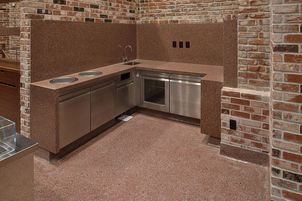
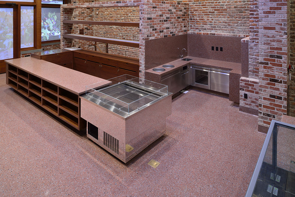
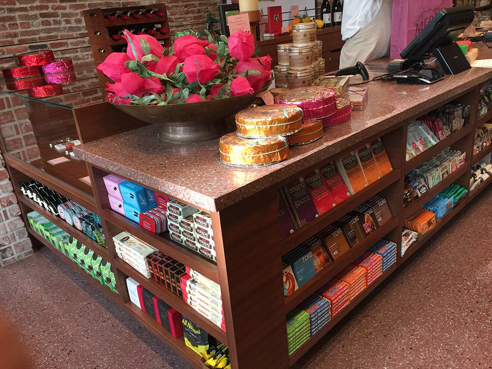
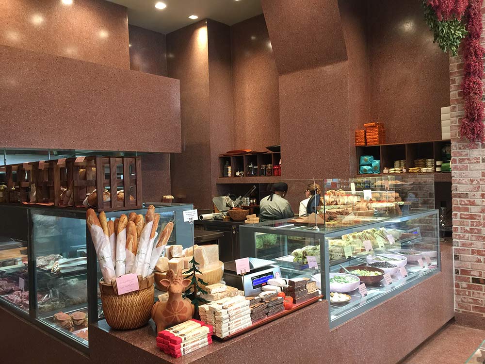
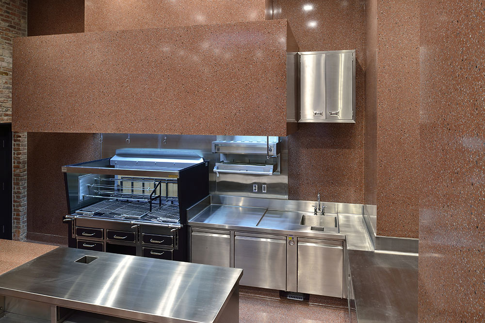
A striking feature of the interior space is the predominance of terrazzo: cladding the walls, 700 square feet rise 18 feet to the ceiling. Precast terrazzo countertops with backsplash and facia continue the theme and tone. Approximately 1,000 square feet of terrazzo flooring was installed along with precast and cast-in-place terrazzo base. A precast terrazzo staircase with stair stringer leads to the basement. The National Terrazzo & Mosaic Association awarded a Special Craftsmanship Award to Associated Terrazzo Company of San Francisco for the off-beat installation in 2017, well before the shop opened to the public.
The design plan evolved over the nine months of construction from day one, when zero terrazzo was specified, to it taking over about 50 percent of the floor and 80 percent of the walls, reported Mr. Copperman.
“The terrazzo is very important, one of the key elements of this project,” Mr. Gatti stated. “I love terrazzo, love the history of it, the philosophy of it, what’s ultimately behind the concept of it: something created from waste marble, glass. It’s an incredible surface.”
Mr. Gatti decided on terrazzo for its look and its practicality. A non-porous, easy-to-clean surface was essential to meet health standards for food preparation. Equipped with a full kitchen, the market will bring in guest chefs and offer fresh meals for take-out.
Next, he wanted a monochromatic look, a simple backdrop to showcase the merchandise. Starting with the old mauve-red brick on one interior wall, the dominant color in the space, the terrazzo was formulated to match it. The aggregate flecks of gray, black and ivory unify the elements of stainless steel equipment, black outlets and ivory ceiling. The color is carried out in the store’s brand identity, down to the bags for shoppers.
“It’s very consistent, clean and smooth with no seams,” Mr. Gatti reported, adding that he loves that countertops, sides, walls, and floor are all the same. “Everything is installed in a thoughtful way: all colors and ideas are integrated into the color scheme. It reads as monochromatic; if you squint, the space is monochromatic.”
Seemingly Seamless
To create terrazzo-clad walls without divider strips and a poured-in-place appearance, six- to seven- foot square or rectangle terrazzo wall panels were precast and finished offsite. The terrazzo contractor then installed them and patched them together in place for a seamless appearance, explained Eddie Lourenco of Associated Terrazzo Company.
Pre-casting the panels allowed for tight, sharp and true inside and outside corners, a detail requested by the owner. A 3/4-inch radius on inside corners is typical in cast-in-place terrazzo because of the challenge of grinding a perfect 90-degree corner once it’s in place.
The wall sections were attached with epoxy glue over a plywood substrate that was screwed to wall studs. The edges were chiseled to avoid straight lines, then the joints between the separate panels were patched, hand-ground and hand-polished.
The epoxy mix was modified with a thickening agent for the vertical application so that it wouldn’t run when applied. Because both the thickener and the grinding speeds of hand tools affect the color of the terrazzo, a divider strip is typically placed between the vertical terrazzo and the horizontal terrazzo floor, which is generally enough to trick the eye from noticing any difference in color between the two according to Mr. Lourenco. On the walls, the thicker formula was used throughout in both the offsite precast and in the field vertical patchwork to keep the color consistent.
Using precast panels also helped speed the process in the field. The crew spent about two weeks casting in shop and two weeks onsite.
“Polishing in the field is an extremely exhaustive process and very challenging to achieve the finish,” observed Mr. Copperman. While machine polishing on a floor is aided by the force of gravity, hand-polishing on walls, where any imperfection would have been evident, presented a double challenge. “The contractor spent an enormous amount of time to get it perfect.”
Investment in Beauty
For Mr. Gatti, the design and restoration of this building is an investment in his community and his environment, more than in his bottom line.
“The money mongers are ruining the landscape of our cities, not to speak of our world,” Mr. Gatti declared. “Cheap apartments and terribly designed architecture are changing the way we think on a big picture level.”
The architect who drew up the plans, Elmer Lin of Consortium, explained: “This little building was given more attention than it ‘deserved.’” This little building could easily have been lost in the development rush. With the value of land, it could have been leveled for a ten-story condo for immediate return on investment.
“Instead we decided to keep and revitalize the gem that it is. This renovation is a monument to the love of the building.”

