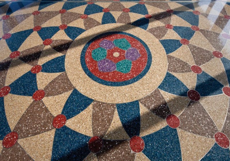
National Honor for Terrazzo Installation That Tells Credit Union’s Story
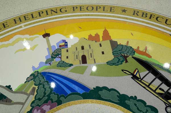
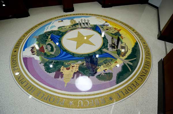
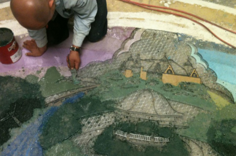
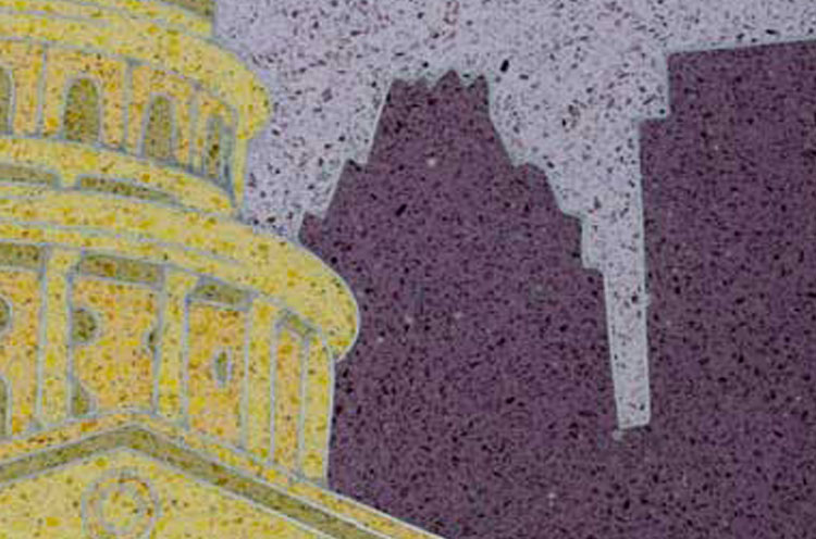
The award-winning terrazzo installation in the Randolph-Brooks Federal Credit Union (RBFCU) is the result of an intense, yet collaborative, tug-of-war between the terrazzo contractor and designers to push the limits on terrazzo artistry. A 16-foot pictorial medallion, the centerpiece of the installation, depicts iconic images of Texas history—the Alamo, the state flag, the state capitol, the Guadalupe River, a Texas Ranger, Randolph Air Force Base—in 54 color combinations of epoxy terrazzo.“There’s really nothing quite like it,” said Sonya McDonald, Sr. VP of planning and market development at RBFCU.
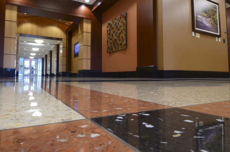
“It’s an eye-catching and unique piece that takes people’s breath away. People are accustomed to seeing art on the walls, but most have never seen such a high level of intricate artistic design built into the floor.” Along with its exceptionally detailed graphics, this 9,800-square-foot project in the credit union’s San Antonio corporate headquarters showcases four different terrazzo systems and a total of 69 colors. A 2013 Honor Award winner in National Terrazzo & Mosaic Association’s (NTMA) annual search for outstanding examples of terrazzo craftsmanship, the project vividly demonstrates the design potential of terrazzo flooring systems.
In the planning stages of the project, the designers and architect had a vision for the medallion they wanted to create. What they didn’t know was what was technically feasible, or how refined the details could be, explained Lawrence Di Filippo of Venice Art Terrazzo Company of San Antonio, the contractor on the project.
“You can dream but it’s not necessarily possible,” Di Filippo said. “They tried to stretch us.”
Working closely with the architect and designer, Di Filippo’s team and the strip manufacturer collaborated to rein in and simplify where reality demanded. In other areas, details could be added and further refined. The result was beyond what designers had hoped.
“I’m starting to think there’s nothing terrazzo can’t do,” said project architect Debra Babcock, with Chesney Morales Architects/Planners & Associates of San Antonio. “I love working with it. If you can think of it, it can be done.”
Description of the Project
The four different terrazzo systems installed, complementing the structure’s Capitol Hill-inspired classic features, demanded the skills of a craftsman with a spectrum of experience. As one NTMA judge declared, this project was a “terrazzo man’s job.”
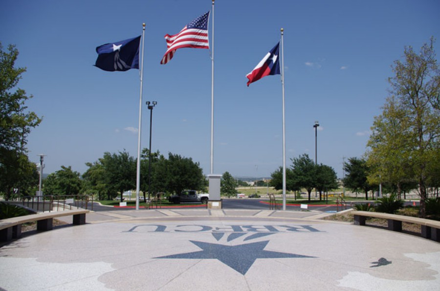
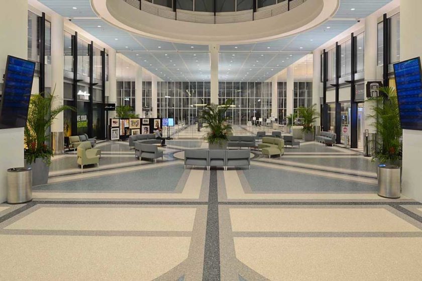
For the building’s main lobby, corridors, and elevator lobby, three-eights-inch epoxy thin-set terrazzo in eight colors was specified. Outside, rustic terrazzo sidewalks and stairs lead to a plaza where the corporate logo is inlaid in a landscape of hills, sky, jets with jet streams, and birds in a ground-and-polished sand-cushion terrazzo system in seven more colors. Precast terrazzo benches frame the plaza.
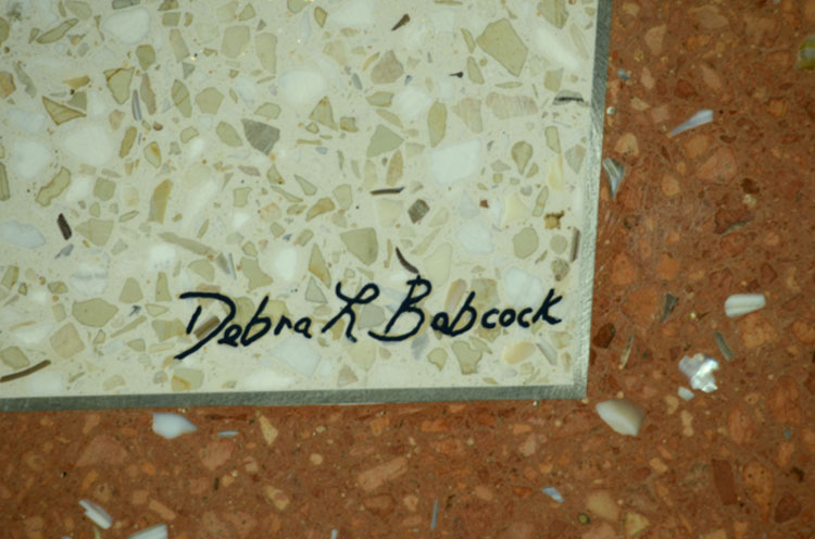
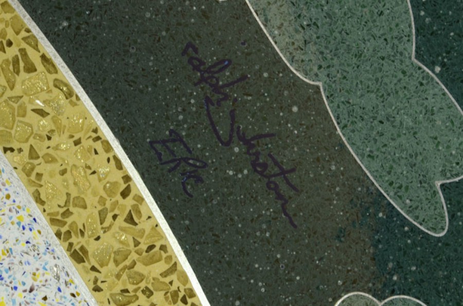
As a final flourish to the graphic design, the artists’ and design architect’s signatures are engraved in the lobby floor and in the medallion.
“The whole job is graphics, no plain terrazzo,” said Di Filippo. “It tells a story everywhere you go.”
Telling the Story of RBFCU
This project is the second phase of construction for the location. Going into the first phase, built in 2003, the owners were looking for a durable surface, explained Babcock, who was on the project from the beginning. She recommended terrazzo for its design capabilities as well as its permanence.
“Terrazzo will outlast the rest of us,” she said.
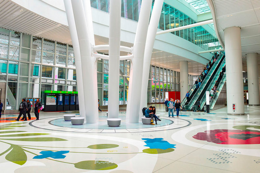
She noted that although terrazzo is often seen as the flooring of choice for airports, “it can be so much more than that. You can get extreme detail out of it.” When it was time for the second phase, the owners, pleased with terrazzo’s performance, were “right on board, they wanted it again, no question,” Babcock said.
For this phase, the owners also wanted more than just something solid to walk on. They wanted a floor that would tell the story of RBFCU and illustrate its motto: “People Helping People.” They were also looking for a unique way to link the two buildings.
The result was the Randy M. Smith CUseum, a credit union museum. The terrazzo medallion plays a central role in the museum’s presentation of the themes and history of Texas through art, video, sculpture, and design.
Pushing the limits: Getting the Most from Design Details
The precision details in the medallion include an airplane with its propeller, stripes, rivets, and windows. The 3D images come to life in the windows in a tower, a tiny clock in a gazebo, and multicolor shading on a roof. Sky, trees, leaves, and earth are vividly drawn, down to the texture of the bark on a tree.
RBFCU’s graphic designers, Erick Messinger and Ralph Johnston, drew the original rough concept for the medallion. Then the next steps of producing a final drawing for production became “a fine-tuning process,” according to Di Filippo.
The terrazzo contractors made the first adjustments based on the scale of the details and the limits of bending divider strips in various thicknesses.
“It’ll turn out better with this gauge,” were among his recommendations, or “Simplify here,” or “You can bring in more detail here.”
With the next step came further refinements from the divider strip manufacturer, and more back-and-forth discussions among the team.
“Venice Art is extremely easy to work with and was a wonderful resource,” noted Babcock. “Step by step, they helped me see the options.”
In the next stage, Venice Art produced 54 color samples, with elements of clear glass throughout unifying the tones.
“Terrazzo offers infinite colors,” said Babcock. “You can get any color you want: create and blend your own colors or match anything you want.”
Technical Details: How It Came Together
The complete divider strip design arrived crated from the manufacturer, Di Filippo said. The graphic designers then came out and added strips and made corrections to it. Four or five days went into finishing it: cutting, laying out, fixing and soldering the intricate set of thin-gauge strips in preparation for pouring in aggregates and epoxy colors.
Size zero, extra-fine aggregates were specified for the medallion, to keep the focus on the design and colors, enhanced by the metal divider strips.
For the rest of floor, the design brought in larger aggregates, size-one and -two, with mother-of-pearl and plenty of recycled glass and marble. A bold corporate logo accents the space.
For most terrazzo jobs, the contractor is given a simple drawing of the design. For the medallion at RBFCU, the designers provided a set of drawings, layering out complete sets of the separate colors.
Adjacent colors can only be poured with time to dry in between, so two or three colors were poured each round. It took about a month to fill the medallion in.
Then it was ground down and polished to reveal the intricacy and shine of the images.
“It was a very slow process,” Di Filippo noted.
The level of craftsmanship on the job is seen in the neatly mitered joints and clean colors, and the successful integration of the different products in the project as a whole.
NTMA judges praised particularly the medallion’s extraordinary detailing and the uniform use of big chips and hand shading on other areas of the job, also noting the well executed black tones.
“Often times you have ideas that, once completed, fail to meet your expectations, but in the case of the terrazzo, especially the medallion, it far exceeded my expectations,” said John Kelly, CEO of RBFCU.
“The terrazzo installation truly did exceed our expectations in the level of detail, artistic expression and craftsmanship,” RBFCU’s McDonald added.
