Chicago Community Center renovation with a Gradient Sky
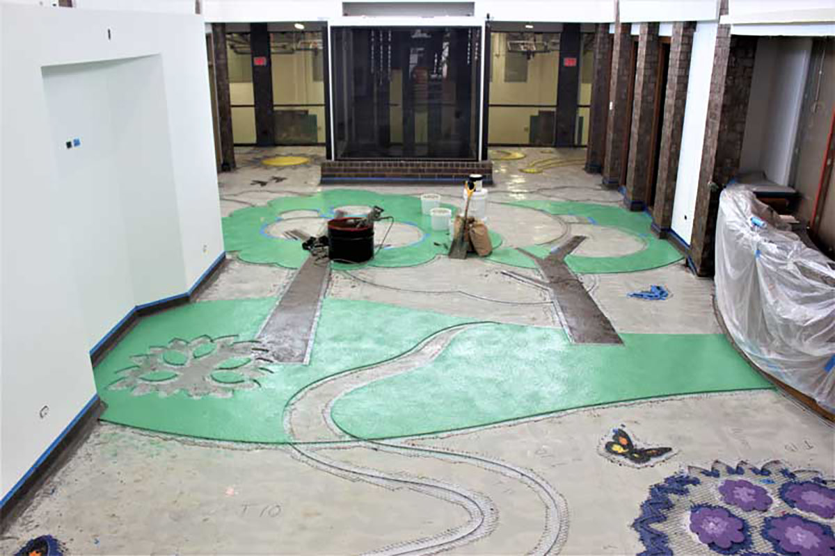
Monarchs, buckeye butterflies, and chimney swifts welcome visitors to Chicago’s Franklin Park Community center. The lively, playful space reflects the natural elements found in the city parks, including a gradient sky in the terrazzo floor, complete with sun and clouds, moon, and stars. The hand-made, large-scale public art installation engages visitors of all ages.
“It was a project close to the heart of all those involved,” said project consultant Anita Ambriz, an experiential graphic designer experienced in terrazzo design. “I find that clients look for dynamic design and message-driven content that creates visual interaction between users and their environment. Terrazzo provides the opportunity for infinite expression.”
The concept for the floor at Franklin Park was developed by the park district’s long-time graphic designer, Andi Pihl. This project was both the designer’s and the park district’s first experience with terrazzo flooring, so they relied on the terrazzo contractor and Ambriz to take the concept fully to reality.
From Day to Night
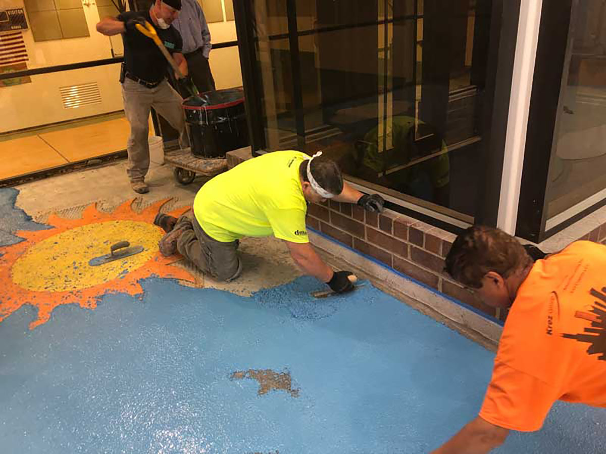
The gradient sky, in which epoxy colors were poured onsite to create a split fountain effect, was a particular design and implementation challenge. To begin the process, the graphic designer specified three base colors and reference points of location for these colors in the sky, according to Chad Rakow, vice president of terrazzo contractor John Caretti & Co. of Morton Grove, IL.
“It was our responsibility to create the remaining colors to provide an outcome that would be a seamless blend,” he said.
Terrazzo artisans accomplished this smooth transition from daylight to the night sky by blending 13 different epoxy matrix colors and 18 different aggregates. The aggregate mix is specific to each color, with similar elements used to create gradual transitions. Varying the size of aggregates or adding clear glass in sizes 0 and 00 achieved subtle color nuances
The color change was completed without divider strips. Each successive color was poured against the wet edge of the last. An 18-foot-long mock-up of the gradient color change was completed for approval before installation.
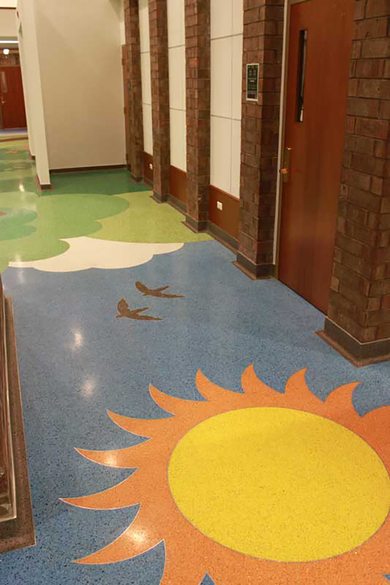
The color change was completed without divider strips
From Illustration to Floor
“There’s a big difference between an eight-by-ten illustration and a floor,” Ambriz noted. She worked with the design team to refine and scale the initial design and produced the final artwork, ready for divider strip fabrication.
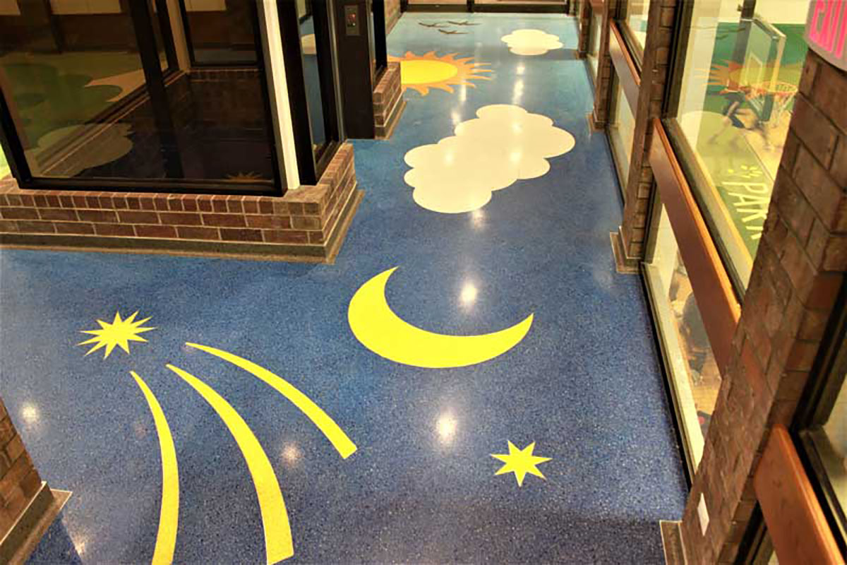
Celestial images
Most of the aluminum divider strip design was prefabricated off-site due to the design’s complexity and the limited staging space. Smaller and highly detailed design elements were waterjet cut.
The pre-manufactured divider strips arrived at the job site in large sections that were purposely oversized so the floor pattern could be tightly cut into the toe strip of the poured-in-place wall base, Rakow noted. The large sections of strip were also meticulously adjusted so the seams between the premade sections would be invisible in the completed floor.
From Samples to Colors
Other than in the gradient sky, aluminum strips separate all color transitions. Working from the graphic designer’s specified paint-chip choices, the design team followed an eight-month selection process. Starting with 94 samples, 38 colors were chosen. Ambriz noted that the challenge was creating colors with aggregates that enhanced the tones without making them muddy or appearing overly complex.
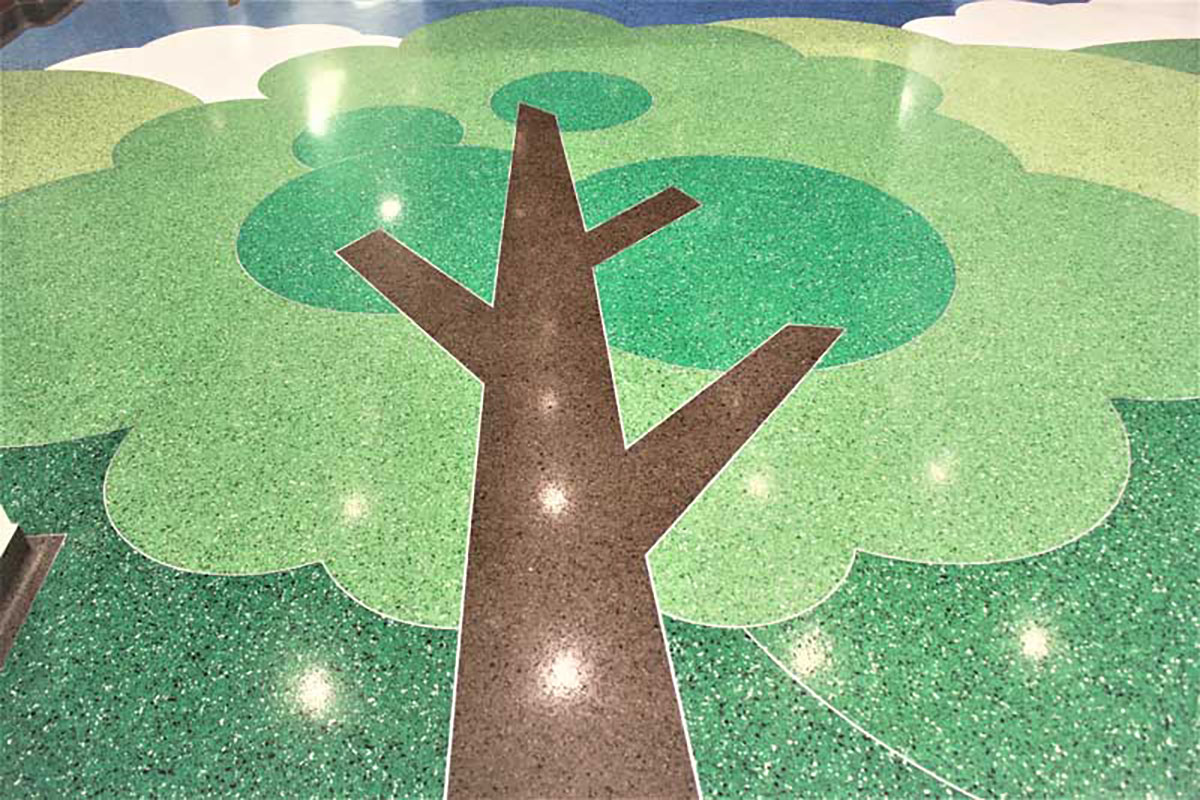
The design team followed an eight-month selection process.
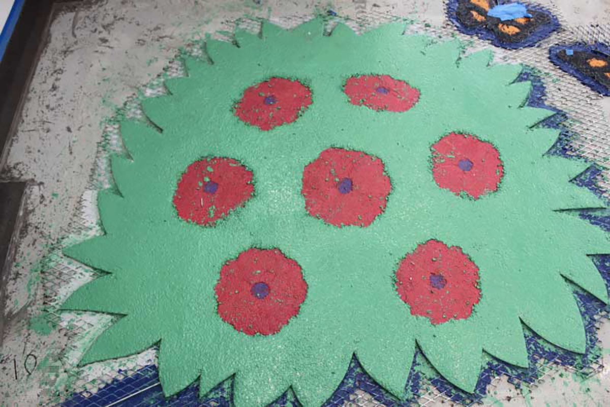
The 48 different aggregates (marble, glass, art glass, mirror, and mother-of-pearl) were mixed onsite with colored epoxy to create the 38 different colors. The most detailed element, the butterflies, with 1/4-inch polka dots, contained nine terrazzo colors. The smallest elements were filled with epoxy only. With the help of the terrazzo contractor and materials suppliers, formulas containing up to ten different aggregates were developed to support each color. The aggregates add dimension while providing a unifying element in the color scheme, Ambriz explained.
“As designers, we use graphic design to create environments that communicate,” she said. “Terrazzo’s flexibility for expression, from dynamic to subtle, provides the opportunity for rich visuals that link the user with the place and the messages about the place. It’s so expressive! I really enjoy that.”
